

Handy Brite Flashlight Repackage
Ultra-Bright Wide-Beam Work Light
Natasha Knight - DESN 366


For this project, I started with a trip to Home Depot. I'm not going to lie, I expected a lot more variety when it came to excessive packaging, but I was surprised. One thing I came to realize that a lot of people shopping at Home Depot aren't exactly making purchases based on aesthetic package design, but instead they usually come in with a list already in mind. This is fine, but it slimmed my pickings for finding a product.
Repackage Ideas


Here are my original pictures that I found and planned to reference. There are also some sketches and notes taken. For my first mockup, I referenced the product pictures, but for the second two I took a different route. I realized that the first idea did not provide standing flexibility, so that's when I decided that I wanted to make something that could be on display -- hanging or standing.


Here are my initial repackage mockups -- they are pretty rough, but this was mainly to just experiment with shapes. I used the cover of one of my old sketch books. This was a good exercise because it made me think of multiple options and I actually ended up not rolling with the idea that I thought would be the best originally.


I went with my third mock up and made a few options based on that. I liked the base so it can stand and I also think the collar would be a necessary addition, so I made sure my next round of mockups included those.
Instead of a separate piece of material (or collar) to support the handle of the flashlight, I used a strip that was already attached to main piece of the package. I also narrowed the boxy base to fit a little more snug around the bottom of the flashlight handle base. As you can tell from the measurements scribbled on the picture, the third one is the one that I went to dissemble and trace for the next step in the process.


Woo hoo! It's starting to look pretty. After tracing my design on Illustrator, I added any fold or cut lines to indicate what would be happening and where. This step was fun because things are starting to look a bit more official and not so much like a kindergartner's art project.


After printing the first draft on kraft paper and assembling it, I immediately realized what needs adjusting. We were also supposed to print another copy on just regular paper for note taking, not assembly. This was a good idea because once you have this three dimensional product it's hard to know exactly where to make notes of adjustments.


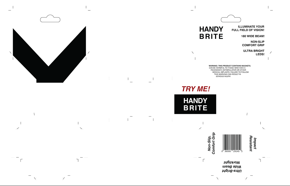
The top images are the assembled first draft -- not bad, just a few minor tweaks needed. For starters, there were a few structural issues, like the front tab (which reads "ultra-bright wide beam work light") was about half a centimeter taller than the sides, which was not intended. The tab reaching across the back was also just a bit too short, which I didn't think would be noticeable (because it's on the back) but as you will soon see, I am migrating a lot of the information for the product to the back. Another issue was cutting the side tabs that hold the base together. As shown, you can see that after getting rid of the outline it is very easy to lose track of those cut marks. I spoke with Travis and he said for situations like that you can add a light outline just because it will be tucked away.

When it comes to print, there is where I wanted to change quite a bit. For starters, I decided to take away the print for the front side. The only thing printing on the front half of the project was the black 'v' shape shown on the right (this was to mimic a light beam). Honestly, it didn't meet my aesthetic expectations and it was a pain to deal with the alignment of the front a back parts of the package, so I eliminated it to just focus on printing strictly on the 'back' side.
I wanted to also change up the logo, move the logo, move the warning label, adjust the vibrancy of the red, and change up the format of the back. You can see some notes that I made on the scanned paper.


Here is my second print. I am considering doing one more print just because there are a handful of adjustments that I think I can make to make it even better. For starters, the collar isn't as long as it should be. This was a bit of a shock to me when I was assembling it because the printed draft before worked nearly perfectly when it came to wrapping around the handle of the flashlight. Because it's really tight around the handle, the text seems a little warped. Since material is being used to fit around the handle, the back warning panel is not centered at all. It is a little tight around the base as well, so it would probably extend it just a centimeter or two.
I thought the text came out nice though. Adding more black was the move in my opinion -- it makes the kraft paper just a little more dynamic. I also am glad that I bumped the brightness and saturation on the red.
Overall, I think I'm just one print away from what I had in my expectations.

Updated second print layout.


And here's the last print. I adjusted just a few measurements and then took nicer pictures for the final presentation. Overall, I'm glad I did another print because this one is structured a lot better and it can easily stand on its own. Check out my Milanote board for a more in-depth look on my process.
